Club Jasmin Rebranding Project
2018
Club Jasmine is a heritage brand that pioneered the first VIP program in Korean department stores. However, it lacked a distinct brand identity and cohesive visual system. To maintain strong brand loyalty and differentiate it from competitors, our team redesigned the brand identity to evoke the elegance of a luxury brand.
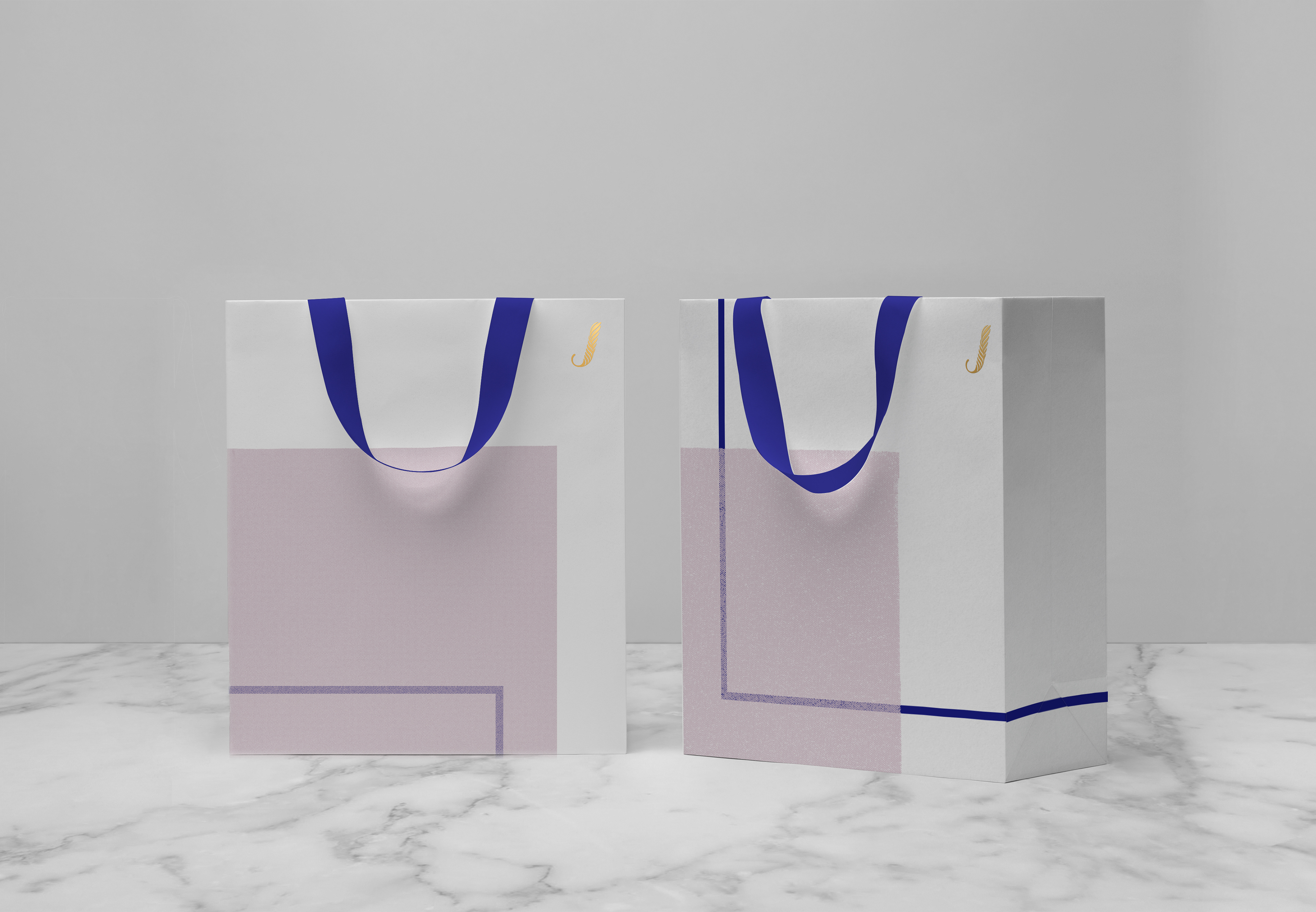
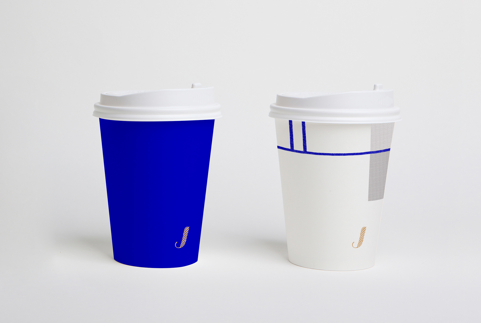
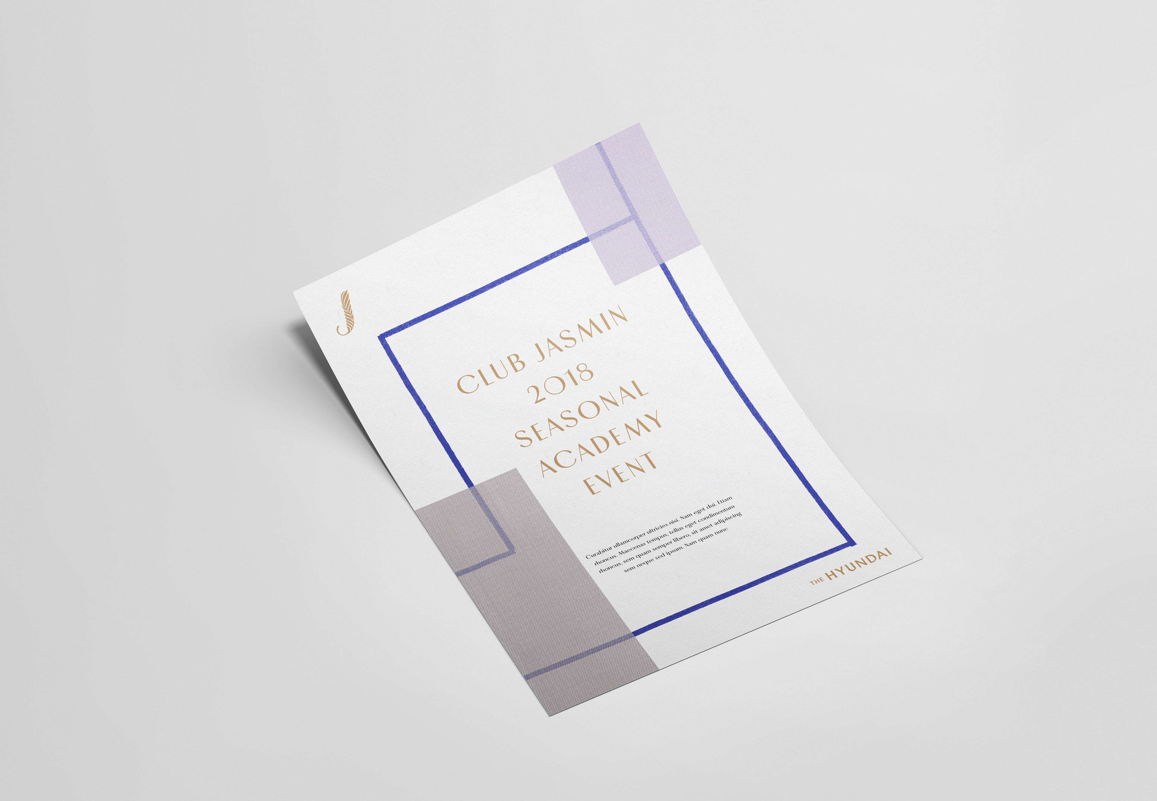
The new symbol combines jasmine petals with the letter "J" for Jasmine. Royal Blue and Noble Gold were chosen as the brand colors to convey sophistication and elegance while ensuring a clear distinction from other brands.
By offering experiential services such as themed tours and performances, we identified the growing demand for emotional brand loyalty. In response, we developed a flexible identity system that can be seamlessly integrated into cultural content. The use of blue lines and translucent planes, inspired by traditional Korean patchwork, enhances the refined and graceful image of the brand.


Editorial design


Package design


Credit card


Valet Sticker


Promotional package


Club Jasmin Rebranding Project
Project Direction
Youngshin Jang & Ee-rang Park (The Hyundai)
The Hyundai Design Team
Art direction: Ee-rang Park
Project management: So Young Song
BI application design: So Young Song, Minjee Kim
Signage system: Hyeyoung Yoo, Bora Kim
CFC (Design agency)
Director: Charry Jeon
Designers: Saerom Kang, Eunju Kim, Minsun Lee
Photographer: Kiwoong Hong